5 Websites Elements That Drive SaaS Signups in 2025
You’ve built something great. It’s faster than your competitors, easier to use, and priced just right. People who try it, love it.
But here’s the part too many SaaS teams overlook: the product isn’t what gets people through the door. Your website is.
And if your website can’t turn visitors into signups, none of it matters.
SaaS website development is about more than simply putting your product online. Your site should show why your product matters, not just what it does. It needs to earn trust quickly, make everything clear up front, and guide the right people toward the next step.
Basically, it should be your best-performing sales person.
So, what makes a SaaS website great? Below are five essential elements that will make sure you see more signups in 2025.
- Smooth User Experience
Visitors shouldn’t have to hunt for important information or hesitate before clicking a button. The best SaaS sites remove obstacles by loading fast, making navigation simple, and working well on any device.
Great design goes beyond visuals to make the user experience smooth and easy. Clean layouts with plenty of white space keep things from feeling crowded. Clear menus and thoughtful structure help visitors move through the site naturally.
The most effective SaaS websites also keep things simple without dumbing them down. Features are easy to access, dashboards are clear and actionable, and onboarding flows make new users feel at home right away.
Example: Dropbox
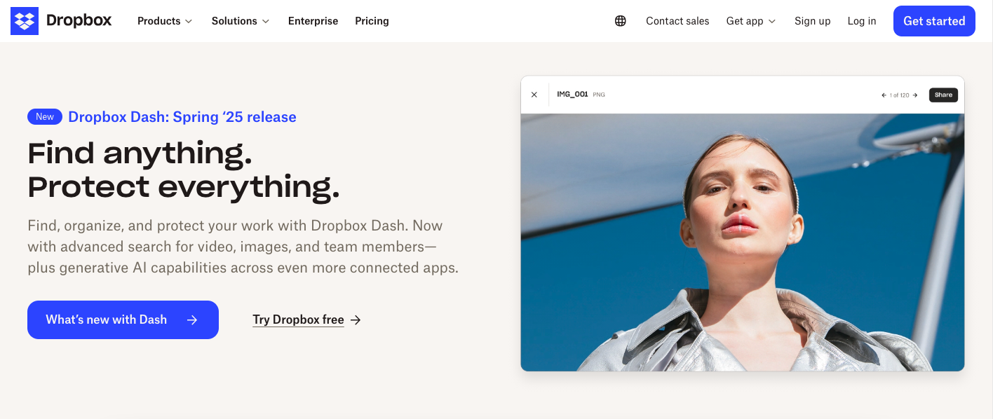
Take Dropbox for example. Their homepage combines a simple, tidy layout with clear messaging and bold buttons that stand out without being overpowering. The site loads quickly, the navigation is intuitive, and helpful visuals show the product in action.
All this makes it easy to understand the value and encourages visitors to take the next step with confidence.
- Clear Value Proposition
Your value proposition is the first thing people see and it decides whether they stay or bounce. You’ve got maybe five seconds to answer three questions: What do you offer? Who is it for? And why should anyone care?
That’s a tough ask for one line of copy. But when it’s done right, it turns a casual visitor into an interested lead.
To get there, combine what you do with what you do best. Simple formula: what you offer + why you’re better at it = value proposition.
This sentence should sit front and centre on your homepage, right in the hero section. A/B test a few variations with your team. Once you find one that works, keep it consistent across your site and other channels.
Example: Notion
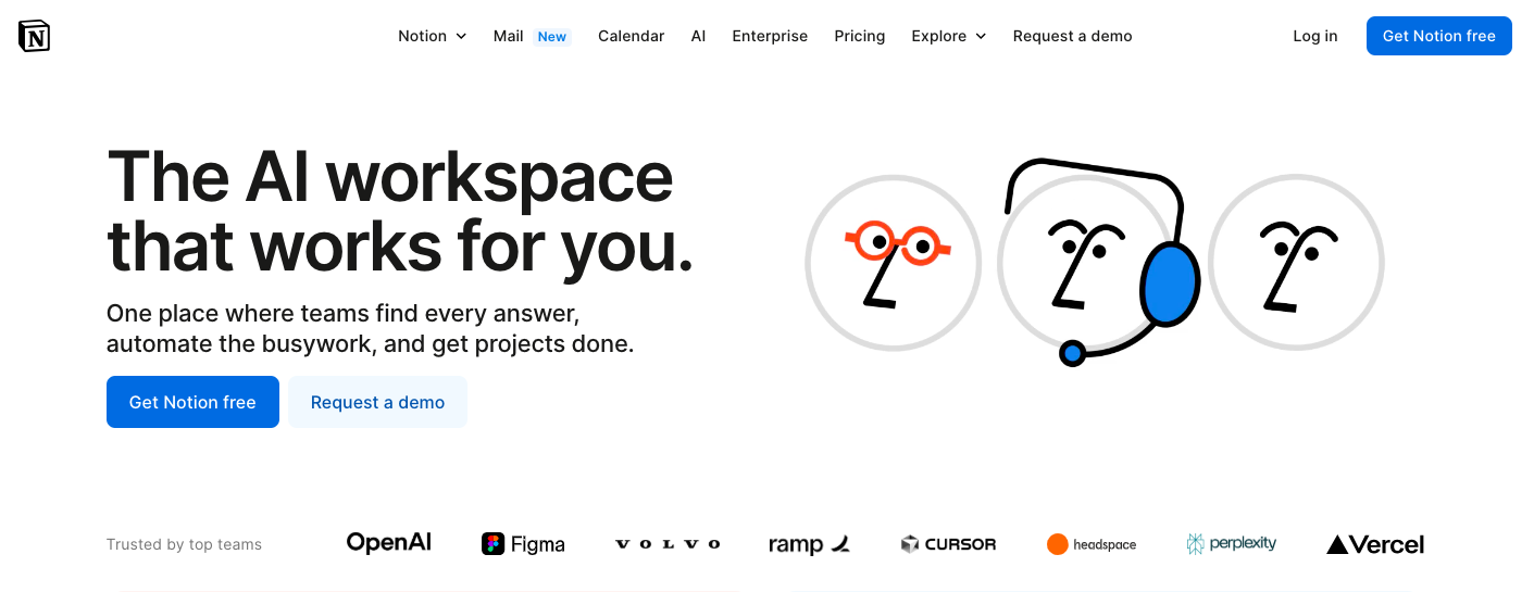
Notion keeps it simple and relatable. The line tells you exactly what the product is (a workspace) and what makes it better (it’s powered by AI and adapts to your needs).
It feels helpful, not pushy, and speaks directly to people who want to stop switching between apps and start actually getting things done.
- Call to Action
A call to action (CTA) is your website’s invitation for visitors to take the next step, and if it’s weak or unclear, your visitors will walk away.
Too many SaaS sites settle for generic CTAs like “Start Free Trial” or “Sign Up.” These phrases don’t explain the value or what the user actually gains. The most effective CTAs match the visitor’s mindset and clearly state the benefit.
For example, instead of “Start Free Trial,” try “Get Instant Access to Your Dashboard” or “See How [Product] Solves [Problem].” These phrases make the action feel valuable and relevant.
Placement is important too. Your primary CTA should be visible above the fold, ideally in the hero section (top right or centred beside your value proposition). Secondary CTAs can appear mid-page (after key benefits) or at the bottom as a final nudge.
Example: Clockify
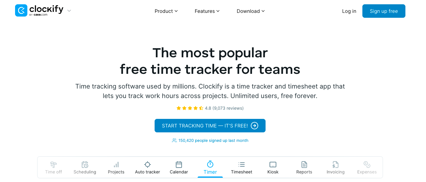
Clockify’s CTA does a great job of combining action with a clear benefit. Instead of just saying “Sign Up,” it tells visitors exactly what they’ll do right away (track time) and reassures them there’s no cost.
This kind of clear and friendly language makes it easy for people to take the next step without thinking twice.
- Free Trial
Free trials are one of the strongest conversion tools in SaaS. When done right, they let users explore your product with zero risk, zero pressure, and no credit card form slowing them down. It’s a chance to show (not just tell) what your software can really do.
To get the most out of your trial offer, keep the signup process simple. Avoid long forms and unnecessary steps.
Trials should be clearly promoted across your homepage, pricing page, and product sections so users don’t have to look for them.
Once they’re in, offer in-app tips, email nudges, or guided onboarding to help them unlock value fast.
Example: Instantly
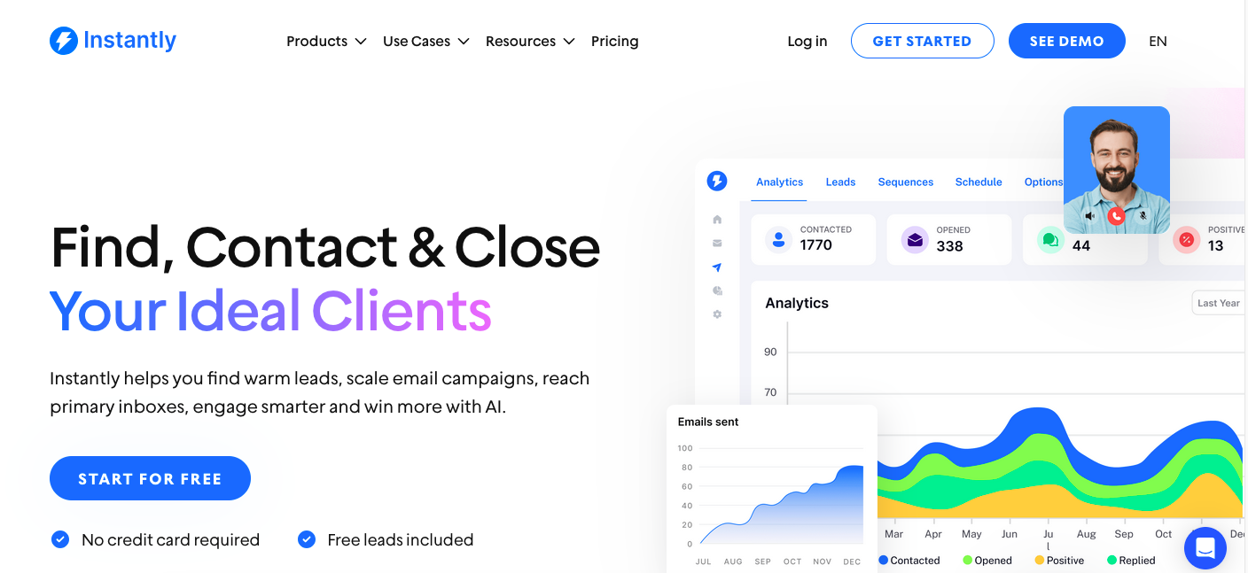
If you’re wondering where to place your trial CTA, Instantly shows exactly how to make it obvious, low-commitment, and compelling—all above the fold.
- Social Proof
Before they sign up, most buyers want proof that your product works and that other people are already seeing results.
When done well, social proof builds instant trust and nudges visitors closer to taking action.
Instead of just saying your product is great, show it through the success of others. Strong SaaS websites weave in social proof across key touchpoints to guide users through the funnel:
- Customer logos at the top of the homepage build familiarity and immediate credibility.
- Testimonials work best on product, pricing, and signup pages, especially when paired with clear outcomes.
- Case studies offer detailed stories that help prospects see their own potential success.
- Real-time activity popups (like “Jamie from London just signed up”) create urgency and momentum.
- Badges from review sites like G2 or Trustpilot add a layer of unbiased authority.
Example: HubSpot
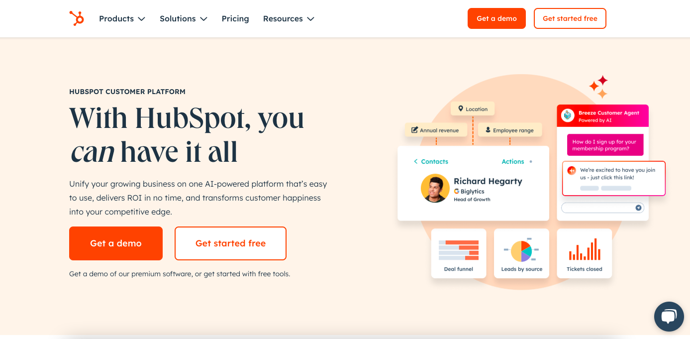
HubSpot layers social proof throughout its site. You’ll spot big-name customer logos right away. Keep scrolling and you’ll find data-backed testimonials and in-depth video case studies.
Final Thoughts
Treat your SaaS website like you treat your software: it’s never really finished. The best-performing sites are shaped by real feedback, tested often, and improved based on what users actually do, not just what you think they want.
Think of the tips above as a foundation to build on. Great SaaS websites come from a mix of strategic thinking, solid design, and ongoing iteration.
What works for one company might not be so good for another. Keep testing, measuring, and adjusting. Most importantly, listen to your users. Watch how they move through your site, ask what confused them or slowed them down, and then act on what you learn.
Vizologi is a revolutionary AI-generated business strategy tool that offers its users access to advanced features to create and refine start-up ideas quickly.
It generates limitless business ideas, gains insights on markets and competitors, and automates business plan creation.
Vizologi
A generative AI business strategy tool to create business plans in 1 minute
FREE 7 days trial ‐ Get started in seconds
Try it freeCreate business plans in 1 minute
Generate limitless business ideas, gain insights on markets and competitors, and automate business plan creation

Thanks for joining us!
Your exclusive content is on the way to your inbox.
Ready to elevate your business with Vizologi?