How Responsive UX Design Increases Your Conversion Rate
Responsive UX design isn’t just a technical buzzword. It’s the foundation of your user experience—and your conversions. When your website adapts fluidly to screens of all sizes, your visitors don’t have to think twice about clicking, reading, subscribing, or buying. Every interaction feels intentional. It’s not about design for the sake of design—make decisions that move your users from interest to action. You don’t have seconds to impress. You have milliseconds. When a form fails to submit on a tablet or a website runs slowly on a mobile device, bounce rates increase.If you’re thinking of outsourcing UI/UX work or investing in Webflow development, responsive design should be a must. This is the starting point for conversions. The fine-tuning that turns passive visitors into active users is what responsive UX is all about.
Frictionless Interaction Means Higher Completion Rates
Every click matters. When your user struggles to scroll, pinch, or tap, you’re inviting them to exit. Responsive UX removes those barriers, making sure your design decisions align with human behavior on every screen. Even the tiniest lag, overlap, or confusing menu can cause hesitation that costs you a lead. Smooth functionality equates to trust, and trust drives conversions.
Tap-Friendly Buttons Boost Micro-Conversions
Little adjustments lead to large outcomes. Tap-through rates can be considerably increased by strategically placing buttons that are sized for mobile thumbs. Building for hands and habits is more important than just looks.
Tiny CTAs and misclicks damage your funnel at crucial points. How quickly and frequently users behave may be altered by even the difference between a 40px and a 60px button.
Make sure your design includes:
- Buttons with a minimum size of 48px by 48px, adhering to mobile accessibility standards
- Adequate white space around clickable elements to prevent accidental taps
- Clear, high-contrast labels that communicate the action without ambiguity
- Positioning that aligns with natural thumb zones to reduce cognitive and physical strain
Streamlined Forms Reduce Drop-Off
Responsive forms are vital for collecting leads. If your form fields aren’t optimized for mobile, expect fewer submissions. You need smart auto-fill cues, responsive field layouts, and clear error states. These small details determine whether users complete the process or bounce mid-way through. A user-friendly form experience isn’t just functional—it’s persuasive.
Adaptive Content Keeps Users Engaged
If your content stacks awkwardly or requires side scrolling, you’ve already lost the user’s attention.
- Properly reflow content to suit screen size for longer dwell times and higher interaction rates.
- Clear visual hierarchy and mobile-responsive typography help direct focus where it matters most.
Good content presentation is intuitive, context-aware, and designed to guide, not overwhelm.
Webflow Makes Responsive Design Scalable
Your website design is probably being outsourced so you can focus on expanding or making the most of your own resources. Webflow, a no-code powerhouse that enables rapid iteration, reduces development bottlenecks, and saves time, enables the enterprise-quality, dynamic, and responsive user experience.
Custom logic, animations, and CMS workflows in fully responsive experiences is now simpler than ever thanks to the most recent Webflow enhancements.
Similar to how Devolfs responsive web design uses modular structures to expedite UX scaling and maintain consistency across digital goods, Webflow’s component system allows you to construct responsive UI blocks once and reuse them across sites.
This ensures consistency while significantly cutting down development time. It’s perfect when you need to scale quickly and maintain pixel-perfect precision. You reduce manual errors, and every iteration strengthens brand coherence.
Key advantages of reusable components:
- Centralized editing so changes propagate site-wide instantly
- Faster updates across campaigns, product launches, and A/B tests
- Design systems that support scalability across multilingual or multiregional sites
- Improved team collaboration with fewer redundancies
Built-In Responsiveness Requires Less Guesswork
Webflow’s breakpoints allow you to see exactly how your site performs across different screen sizes. You don’t need to guess if your UI will break on a foldable phone or a wide monitor—this immediate visibility improves both design efficiency and end-user experience. Designers can test interactions, load states, and transitions in real-time to anticipate friction.
Hosting and CMS Combine Performance with UX
Webflow hosting is built for performance—you get blazing-fast load times, SSL, and global CDN support. That matters for UX. Your bounce rate will skyrocket if your website is slow.
You can provide dynamic, responsive content that feels personalised and functions seamlessly when you combine that with Webflow CMS. Responsive design is a full-stack performance asset that goes beyond the front end.
Mobile Optimization Is No Longer Optional
Over 60% of web traffic comes from mobile devices. If your site doesn’t respond well on mobile, you’re losing more than traffic. You’re losing trust. Mobile-first design is a strategic advantage that increases conversions, customer retention, and brand credibility. You need to assume that mobile is the default and desktop is the bonus.
Finger-Friendly Navigation Enhances Usability
Icons must be easily tappable, menus must fold up, and interactions must be purposeful. Sticky headlines, hamburger menus, and floating calls to action keep consumers focused and interested. One of the most neglected components that affects whether visitors stay on your website or leave is the navigation. It serves as a link between conversions and content.
Responsive Media Elevates Perception
Videos and photos of high quality should scale without distorting or slowing down load times. File sizes can be lowered by up to 40% without sacrificing clarity by using adaptive picture formats like WebP or AVIF. Your perceived professionalism is directly impacted by optimised media. The media should help, not hinder, your story.
Smart Layouts Improve Scanability
People don’t read—they scan. Use responsive grids and flexible content blocks to direct the eye through your value propositions. You want your most important elements to sit “above the fold” on every device, and responsive UX ensures that they do. Make your CTAs, testimonials, and key features impossible to miss.
UX Investment Has Measurable ROI
Spending on UX pays dividends. Studies show that every $1 invested in UX can return $100 in revenue. You’re not just creating interfaces—you’re reducing friction, increasing retention, and shortening your sales cycle. Responsive UX design reduces abandonment, increases clarity, and encourages repeat behavior.
Quality UX Reduces Cart Abandonment
Responsive checkout experiences are easier to trust. They feel native, intuitive, and familiar. A few milliseconds of delay or a poorly loading input field can cause a customer to leave. Responsive UX keeps the path to purchase clear and convincing. It ensures your funnel remains uninterrupted and enjoyable.
Better UX Equals Better SEO
Google prioritizes mobile-friendly sites. Responsive UX design enhances page speed, dwell time, and bounce rate—all of which feed into your ranking potential. It’s not just a user benefit, it’s a growth hack for discoverability. UX and SEO aren’t separate disciplines anymore—they reinforce each other.
Lower Support Costs Through Clarity
When your interface works across devices and is designed for humans, users have fewer questions. That means fewer tickets, calls, or live chats. Responsive UX reduces support overhead while enhancing user satisfaction. This improves efficiency across marketing, sales, and customer success teams.
Outsourcing Webflow Design? Prioritize Responsiveness
If you’re hiring an agency or freelance UX designer, responsiveness should be at the top of your requirements. A good-looking site that breaks on mobile isn’t just embarrassing—it’s expensive. Ensure your Webflow partner builds for responsiveness from day one. Make it a condition of success.
Your design brief should specify screen sizes, performance benchmarks, and mobile priorities. Include UX goals like “reduce cart abandonment by 15%” or “increase mobile signups by 30%.” That way, your design partner knows responsiveness isn’t optional—it’s central. Clear goals yield accountable results.
Demand Testing Across Real Devices
Simulators aren’t enough. Ask for responsive testing across real iOS, Android, and hybrid devices. Even subtle differences in touch sensitivity or viewport sizing can affect how your users interact. You want responsive design that’s field-tested, not just pixel-checked.
Choose Designers Who Know Responsive UX Psychology
Great designers understand that a responsive experience isn’t just visual. It’s behavioral. They map tap zones, anticipate loading lags, and ensure your call-to-action flows are consistent from phone to desktop.
Choose partners who design for emotion and function. A responsive design team is your growth partner, not just your vendor.
Conclusion: Conversion Starts With Responsive UX
A website that adapts to your users’ devices isn’t just nice to have. It’s critical. It affects how users navigate, feel, and behave on your website. Every change you make can boost your urgency and confidence.
Investing in responsive UX is a growth strategy as much as a design choice. Make responsiveness the norm rather than the exception if you’re serious about conversions, retention, and growing your Webflow presence.
Because your users will have no excuse not to convert if everything functions flawlessly everywhere. Build experiences that behave as intelligently as your brand deserves. That’s how responsive UX becomes the invisible engine behind every successful funnel.
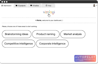
Vizologi is a revolutionary AI-generated business strategy tool that offers its users access to advanced features to create and refine start-up ideas quickly.
It generates limitless business ideas, gains insights on markets and competitors, and automates business plan creation.

Vizologi
A generative AI business strategy tool to create business plans in 1 minute
FREE 7 days trial ‐ Get started in seconds
Try it freeCreate business plans in 1 minute
Generate limitless business ideas, gain insights on markets and competitors, and automate business plan creation

Thanks for joining us!
Your exclusive content is on the way to your inbox.
Ready to elevate your business with Vizologi?