Why Visual Data Storytelling is Taking Over Traditional Analytics
TL;DR: Businesses generate massive amounts of data. Visual storytelling makes data accessible across all teams, and visuals keep audiences engaged. AI-powered analytics suggest patterns and correlations, turning data into clear, interactive stories.
The importance of context and mapping tools
Data storytelling uses geographic maps, scatter plots, line graphs, bar charts, tree charts, heatmaps, pie charts, timelines, and other data types to craft a great story. When creating a data story, platforms first need to decide what they want their users to know. While data is definitely a good thing, too much can be overwhelming. Without the proper context of a focused narrative, even data visualization experts can struggle to find the significance in their visualization efforts.
One of the most effective approaches to data storytelling is presenting the right data in the best possible visual format. If a story contains an excessive number of images, it becomes more of an infographic. It is not engaging without context. When telling a story, one needs to build a narrative and know when to highlight complex numbers, when to bring in data, and when to provide a written explanation.
Simply seeing the data plays an important part in adding information to the narrative, but it doesn’t tell data recipients the whole story. Your choice of mapping software will play a huge role. For example, Maptive mapping software helps businesses and analysts transform complex data into interactive, easy-to-understand maps. Instead of sifting through spreadsheets and reports, Maptive allows users to see patterns, trends, and insights in a geographic context, making it an excellent tool for visual data storytelling.
Too much data becomes hard to interpret
Businesses generate massive amounts of data. In 2024, we generated around 402.74 million terabytes of data each day, which is approximately 147 zettabytes of data generated that year. This number is expected to increase to 181 zettabytes in 2025. Videos now make up more than 50% of internet data traffic. There are more than 2,700 data centers in the US alone, and more are expected to open with plans for grandiose AI projects like Stargate.
Raw numbers and spreadsheets are difficult to digest. Visual storytelling simplifies complex data, making it easier to understand and act upon. A heatmap showing customer activity is more insightful than a long report of numbers.
Visual data storytelling offers a competitive advantage
Companies using data visualization outperform competitors by making faster, more informed decisions. What’s more, visual storytelling makes data accessible across all teams, not just analysts. An e-commerce platform can map purchase behavior to personalize marketing strategies and increase sales.
Visual content enhances engagement
Interestingly, the engagement rate for all post types is 0.71% on average. It’s 1.23% for Instagram reels, 1.26% for carousel posts, and 0.59% for photo posts. For plain numbers, it’s presumably a lot lower. At the same time, successfully engaged customers hold a 23% premium in the share of revenue, profitability, wallet, and relationship growth. While dry, cold numbers can be overwhelming, visuals keep audiences engaged. Storytelling techniques like data animations bring insights to life. Presentations can be more compelling when you use an animated dashboard to showcase a company’s quarterly sales growth, for example.
People process visuals more quickly
According to recent studies, people process visuals 60,000x faster than text. Charts, graphs, and infographics help executives spot trends and make quick decisions. Advanced tools like Google Data Studio make it easier to generate visual reports automatically, and AI-powered analytics suggest patterns and correlations, turning data into clear, interactive stories. Instead of using manual reports, a finance team could automate real-time dashboards to track spending trends.
Recap
- The importance of context and mapping tools
- Too much data becomes hard to interpret
- Visual data storytelling offers a competitive advantage
- Visual content enhances engagement
- People process visuals much more quickly

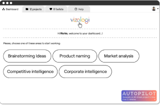
Vizologi is a revolutionary AI-generated business strategy tool that offers its users access to advanced features to create and refine start-up ideas quickly.
It generates limitless business ideas, gains insights on markets and competitors, and automates business plan creation.


