The role of shapes in marketing
Shapes’ utility is not limited to mere aesthetics. Far from it – they carry an array of deeper meanings and evoke a variety of emotional responses to boot. From logos to layouts, the way shapes are used can influence how a viewer perceives a brand, product, or idea. This article explores the powerful ways shapes can be employed in design, going beyond simple decoration to create movement, balance, and emotional connections. On top of that, it’s important to take advantage of the fact that shapes also can reinforce brand identity.
Here are the ways shape affects marketing.
Movement
One can utilize shapes to inject a sense of motion. Dynamic, curved, or angular shapes can be added to guide the viewer’s eye and suggest various forms of motion, which can help the author accomplish the desired emotion or theme.
Take, for instance:
- Speed, direction: created by dynamic shapes like diagonal lines, arrows, and zigzags. This renders them ideal for industries that’d like to convey urgency or immediate action, like sports or automotive advertising.
- Smooth, graceful: curved shapes like flowing lines and spirals. These suggest progression or growth.
- Energy, intensity, and motion: triangles or jagged edges. These work well in advertisements that aim to project power and excitement, such as in technology or high-performance brands.
Repeated shapes can create a rhythm and flow that mimics movement, which is effective in ads for communicating continuous activity or operation.
Here are some famous examples of companies taking this route:
- Nike’s swoosh logo points forward and conveys exactly the same vibe as its commercials do. It encourages people to be more active with its angular emblem, just as its commercial actors always keep running.
- Airbnb: its red color suggests warmth, and the looping in its logo is reminiscent of a warm thread.
- Adidas: in the same vein as Nike, its slanted stripes suggest forward movement and progress.
Balance
Shapes are essential in creating this key design quality, utilizing both symmetrical and asymmetrical compositions that either convey stability or inertia. On the one hand, symmetry can convey order, stability, and calmness. This can be done by placing mirrored shapes on either side of a central point. This is especially common in corporate branding, where trust and professionalism are signaled.
However, asymmetry when used intentionally can make designs feel more dynamic and visually engaging. By placing irregular shapes off-center, designers can create tension, making it look more modern or creative. The scale and size of the shapes should be carefully considered as well to maintain visual harmony. Larger shapes can be used to draw attention or emphasize key elements while smaller shapes can create contrast. White space is also important in allowing each element to stand out and avoid overcrowding.
Examples of these are:
- IBM shows symmetry with its letters; each spaced out evenly to convey professionalism
- Spotify does the opposite, with its diagonal sound waves creating a feeling of energy and engagement
- Apple shows contrast with a round side of the apple whole and the other side bitten into
It’s extremely cost-efficient and will give you a lot of insight into your audience’s taste if you use visual representations such as mockups by Yellow to test out your images and marketing materials on potential buyers before launching mass production.

Emotions
Shapes carry emotional weight. Round shapes like circles and ovals are often associated with warmth, comfort, and inclusivity. These are frequently used in family-oriented product designs, healthcare logos, or community-based brands. Sharp-edged shapes suggest aggression and power, which is commonly taken advantage of by finance and tech firms.
Organic shapes that are more or less free-form and less rigid evoke a sense of creativity, flexibility, and naturalness. You often encounter these in artsy and wellness marketing.
Take Disney, for instance, with its rounded, friendly lettering that makes you feel nostalgic and picture family fun. The “T” in Tesla is sharp and futuristic, exuding strength and innovation. Patagonia’s mountain silhouette represents adventure and the outdoors.
Contrast
The human eye naturally gravitates toward contrasts. When a large shape is situated across from a smaller shape, it creates a natural flow for the viewer’s eye as it moves across the design, making the visual experience more engaging.
Color contrast is another useful element to incorporate. When bold, contrasting shapes of different colors are placed next to each other, they stand out more and create excitement. Suppose you have a bright red circle placed on a dark background – it will make that element visually pop. Think of the Coca Cola logo and the red and white contrast it uses. That makes it feel hip and fun.
Brand identity
The faster your brand can be recognized, the faster clients can recall the value you provide them and what they like about you. This includes your company’s personality, too. Oftentimes, a shopper will look at a broad selection of options but not know for sure what the brand stands behind. By being clear in your identity, your brand doubles down on what it’s serious about providing. That consistency will attract customers who’d rather not risk going with a new brand.
People like things that are familiar to them. Any time somebody sees the Starbucks logo, they instantly recognize it. Few brands even remotely resemble the mermaid and the green color on the Starbucks logo. Pepsi, meanwhile, comes as a signature circle. Pizza Hut has a signature triangle. The more recognizable the shape, the quicker a company can recall a company’s value too. For instance, the jagged edge on the top of the Pizza Hut roof reminds people of the power that a slice of pizza packs.
Typography

The art of arranging type is another key area where shape plays an essential role. The design of fonts, the way letters are formed, and the overall style can influence a brand’s or design message’s perception. Geometric fonts of simple shapes like circles, squares, and triangles tend to have a clean, modern, precise appearance. These work well for brands that want to convey clarity, innovation, and sophistication. The structured and minimalistic form gives the design a polished, contemporary feel.
The choice between serif and sans-serif fonts also significantly impacts the design’s emotional tone. The former, with their small “feet” or extensions on the ends of letters, are often perceived as more traditional, formal, and trustworthy. They are commonly used in the financial and legal sectors. On the other hand, Sans-serif fonts that lack these extensions appear more modern and approachable.
Font weight and style also contribute to how typography shapes the perception of a design. Bold fonts evoke strength and importance, making them good for headlines or call to action. In contrast, thin or light fonts suggest delicacy and elegance, often used for more refined or understated messages. Also, typography can act as a visual shape. Certain letter forms or characters resemble familiar shapes, contributing to the overall design. For instance, “O” could resemble a globe, reinforcing the global or inclusive nature of the brand.
Examples
Google’s simple, rounded letters feel modern and homey. In terms of delicate and light, Tiffany & Co. uses a luxury serif font, which allows women to feel feminine and dainty.
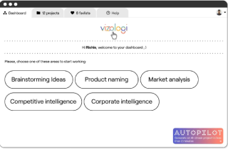
Vizologi is a revolutionary AI-generated business strategy tool that offers its users access to advanced features to create and refine start-up ideas quickly.
It generates limitless business ideas, gains insights on markets and competitors, and automates business plan creation.
Vizologi
A generative AI business strategy tool to create business plans in 1 minute
FREE 7 days trial ‐ Get started in seconds
Try it freeCreate business plans in 1 minute
Generate limitless business ideas, gain insights on markets and competitors, and automate business plan creation
Thanks for joining us!
Your exclusive content is on the way to your inbox.
Ready to elevate your business with Vizologi?